The art of illustration in web design
The written word can feel incomplete at times without an image to support it. Illustration – the visual or pictorial companion to words – helps me understand an idea more completely. I, like many, am just a very visual person, but it also can be a great way to pull a viewer into the story.
Makes sense in terms of web design, doesn’t it? But it can be a hard sell. The commercial world’s easy solution is to reach for stock photos and use tidy, linear design. Illustration seems to have been relegated to something that stands for arty-vagueness, abstraction, decoration, and is often seen as risky. But this just isn’t the case, and it’s time for more brands to take a leap, and they are!
Top 5
Not every brand or web design is suited to illustration, but when there is an opportunity, you should try it. Here’s five reasons why.
1. This time, it’s personal
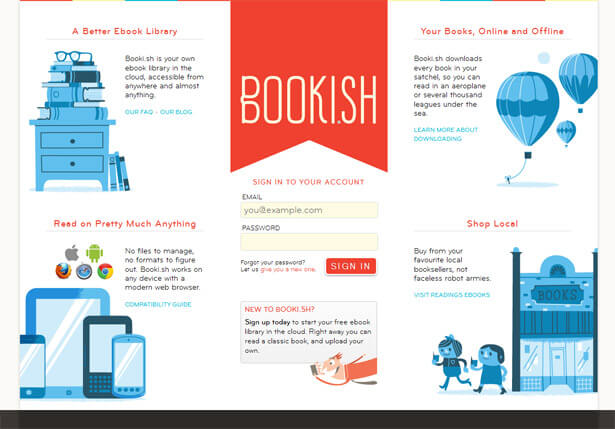
In the saturation of samey-samey stock imagery, it’s good to stand out as a personality, as something exclusive. Is your message different? Is your product? Are your people? They should be. And so should your imagery. It is probably easier and cheaper to go with stock imagery or even stock illustration, then add a logo, a tag, some copy, and go live, all in time for dinner. It can be effective and achieve results, but it’s design by numbers, and may leave your brand invisible. What do polished, airbrushed, generic images of fake people give the impression of? You’ve got it! And some other site has it too.

2. Never underestimate the importance of having fun
People want to relate to brands, and adding even a hint of playfulness can make you more approachable. Fun, lively imagery can energize a brand, messaging, or copy and make you more exciting. Illustrations can be a joy to create, and the feel-good emotion coming from this process can transfer to the reader/viewer.
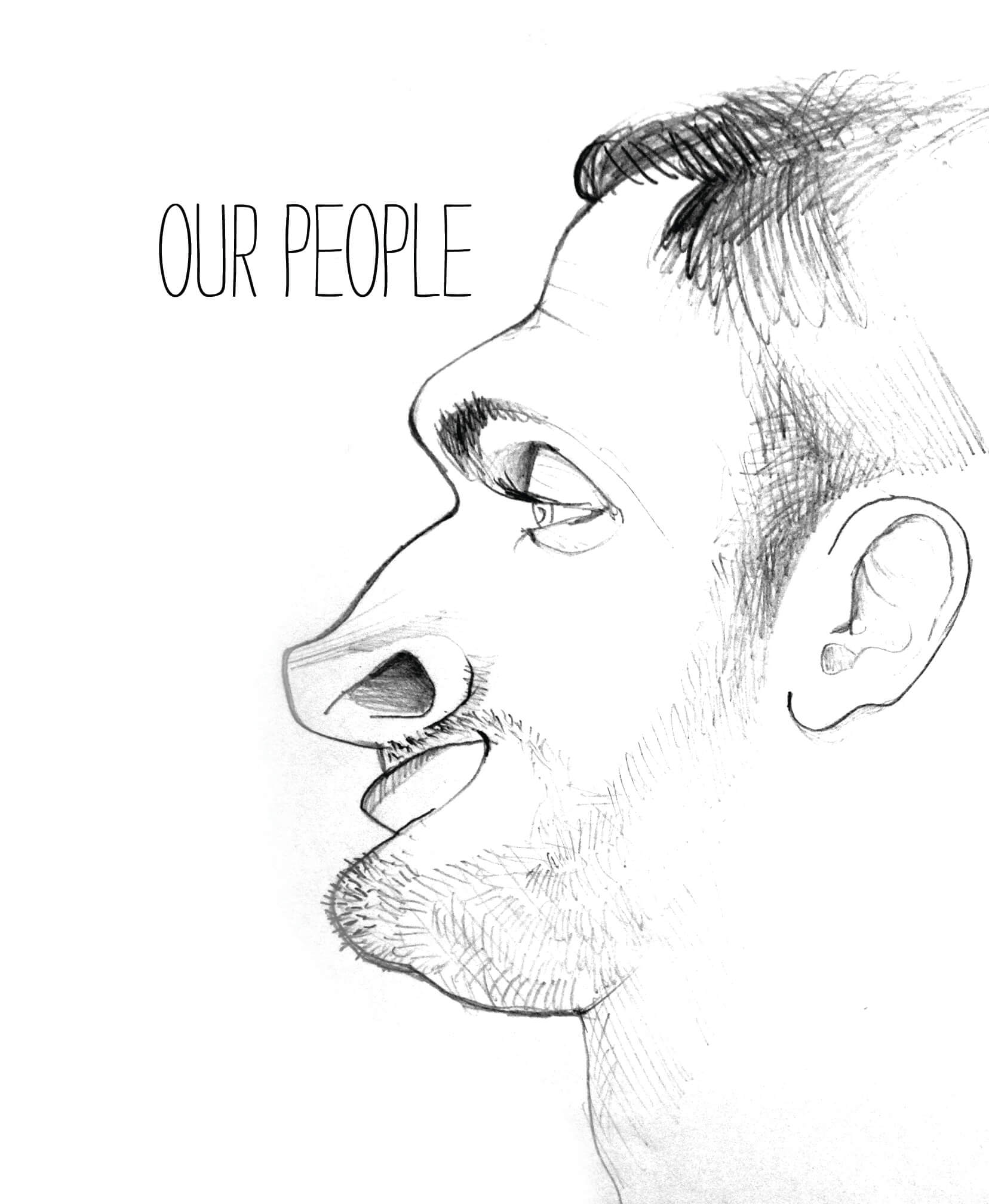
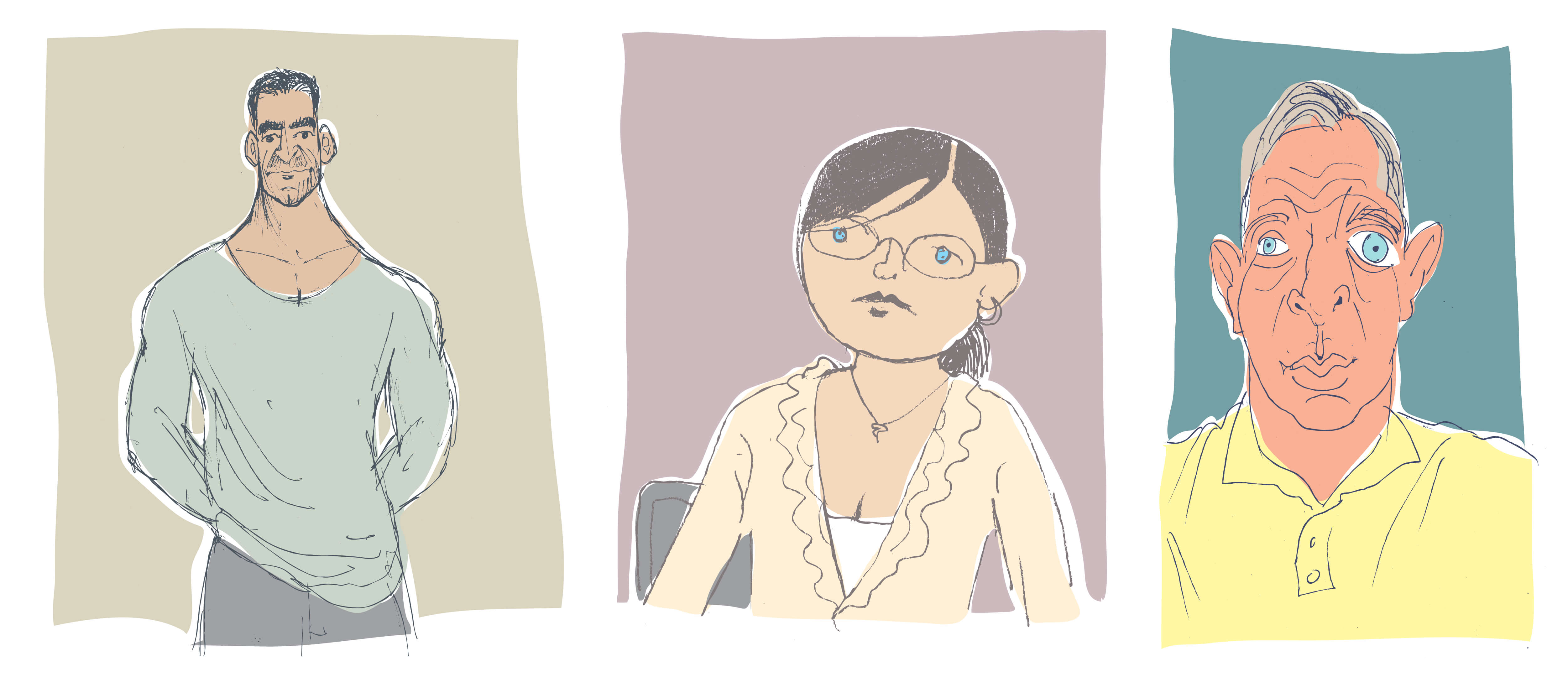
Even using illustrated elements in something as standard as website bios, for example, can add character. It doesn’t take a ton of illustration elements to really make a website more interesting. No need to go overboard.

And fun doesn’t have to mean unsophisticated.
3. We’re engaged!
In the Internet age our attention spans are shorter, calendars have become more packed, blah, blah, blah. You’ve heard it before, and it’s true. Everyone online has a short amount of time to grab your attention. Make an impact with something unique and interesting that not only enhances your visibility, but helps readers digest content quickly and easily at a glance.
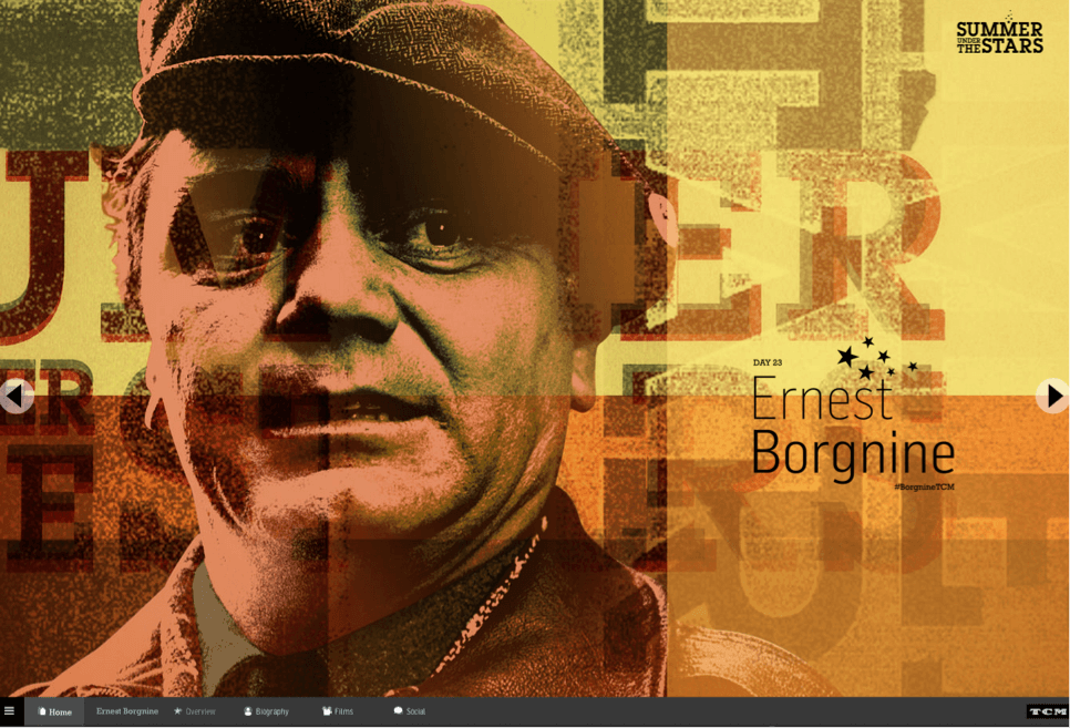
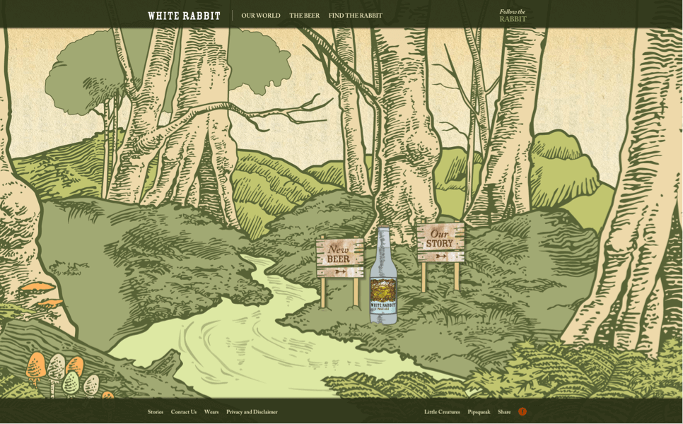
From a more technical perspective, illustration can be more striking by eliminating background distractions and zeroing in on the point. The use of color can influence mood, and a reduced palette can simplify, as it requires less thought from the reader — making it the perfect tool for drawing attention to specific information and accenting CTAs (Calls to Action).
4. Beyond boundaries
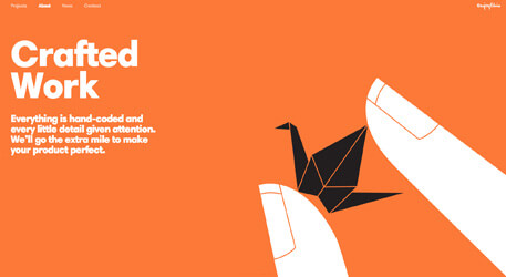
With the ability to alter reality, illustration can pique interest. Distorting reality to suit your needs can make people think differently. Your website can be an interactive storybook; your landing page can be its own world; your CEO can be an alien (!). You can truly break the rules, create a different experience, stand apart, and deliver your message in an unconventional way.
5. Break it down now
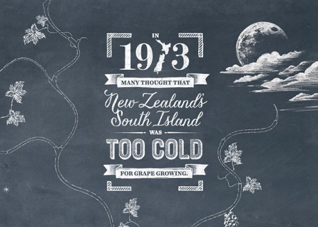
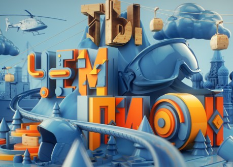
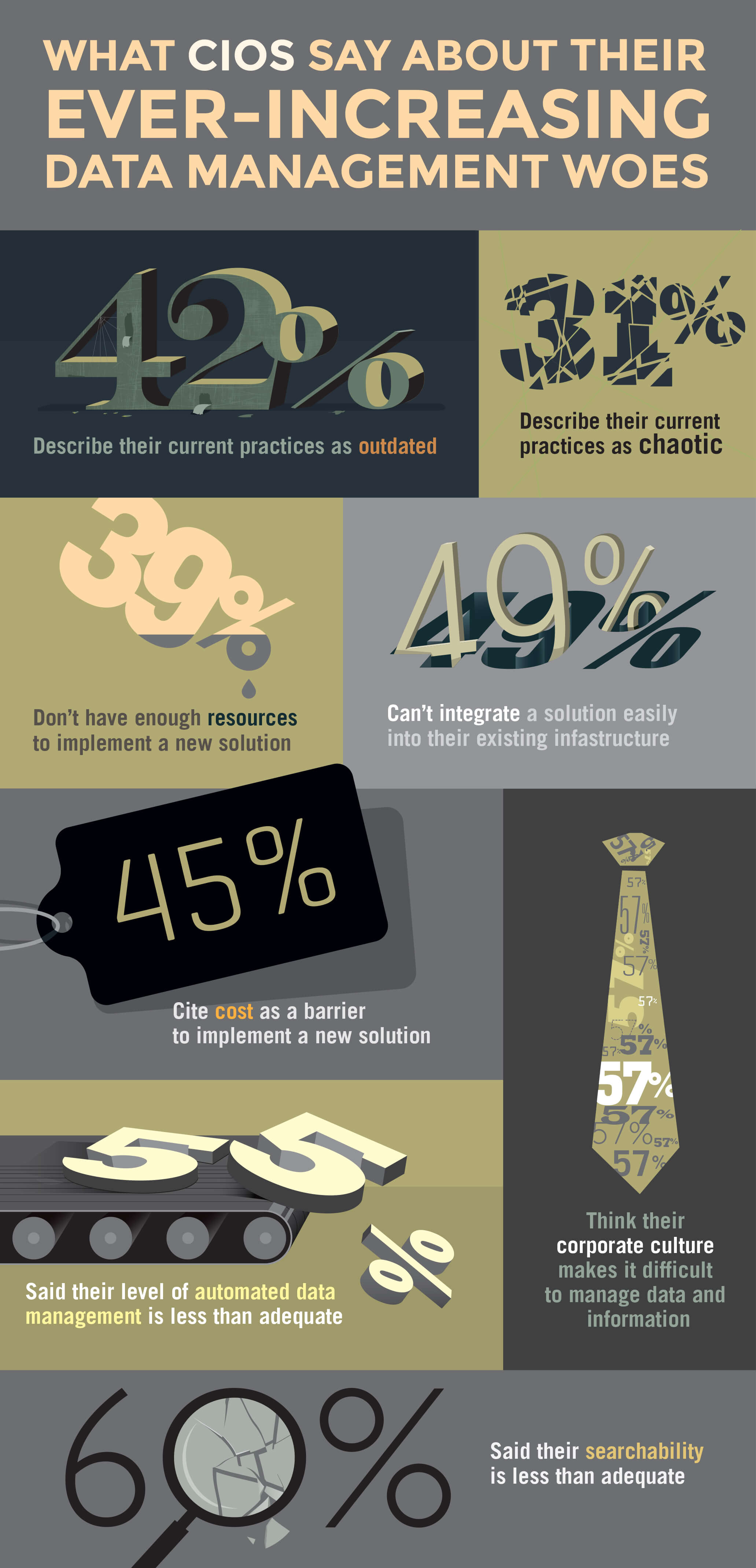
Rather than trying to digest a large expanse of gray copy, people prefer to be given information in colorful, tasty, bite-size pieces. Expressive, creative visualization can help create punctuation and add clarity to even the most complicated messages and technical information. Take something as basic as statistics. In this example, the typography becomes the illustration and survey percentages take center stage, telling the story visually.
Danger! Hand-crafted
Clients presented with the idea of illustration are concerned about cost, control, and breaking from the norm. Unless you’re hiring Milton Glazer (not that he’d agree to it, even if you did have the money), there’s no shortage of talent at a reasonable price, who will give the client control, refine until everyone is happy, and produce something memorable that sets the brand apart. Your agency can help you find the perfect illustration for your company.
Get the best out of your illustrator
Still fazed? Don’t be. A good illustrator is only a good illustrator because they’re a good interpreter, so try to have some questions answered and ideas formed before you sit down and open a dialogue. Who is the audience? What message do you want to convey? What do you want people to experience? How do you want them to feel? What is your goal? What are you trying to do? Can the illustration be whimsical or humorous? Can it be a literal representation or an abstraction? Has a precedent been set in terms of color, style, mood, or is it wide open?
Bring examples or a “mood board” of websites, photography, or artwork inspiration.
Once the illustrator has a grasp on what you’re looking for, set them free!
They’ll probably create something that you could never have imagined. It may even inspire other elements such as messaging or logo. What is for certain is that custom illustration will make you more distinctive, recognizable, and memorable. It will make you an individualist.
Sources: http://www.awwwards.com/websites/illustration/
