UX/UI for B2B: Nine costly mistakes to avoid
Ever notice that logos are usually featured on the top left of a website? Or that navigation tools typically pop up on the right of your phone’s screen?
There’s a good reason for that. Intuitive buttons, screens, and other visual elements are the heart of UI, or user interface. UI works hand in hand with UX, or user experience — the overall interaction a person has with a brand and its products, apps, or websites.
Together, they make a huge impact on how your customers feel — and what actions they decide to take. Make sure you’re not losing valuable business to the following common UX/UI mistakes:
1. Making users wait on a slow site.
Don’t lose prospects before they even see what you have to say. Keep things speedy by checking your server response times, compressing your image and video files, optimizing your code, and removing unused plugins.
2. Forcing users to hop from page to page.
A sitemap that makes sense in your mind might leave users lost in practice. Look at your site from their perspective. Keep pages organized, flowing naturally from section to section with “next step” buttons to guide users along.

For Entegra, we created industry segment cards so every prospect can quickly access content and resources that apply to their business.
3. Distracting users with complex, unfamiliar design.
Simplicity and seamlessness are key, especially in B2B. Avoid overwhelming your customers with loud imagery or distracting animations. Choose familiar tools like hamburger menus over more experimental ones.
4. Taking a one-size-fits-all approach across devices.
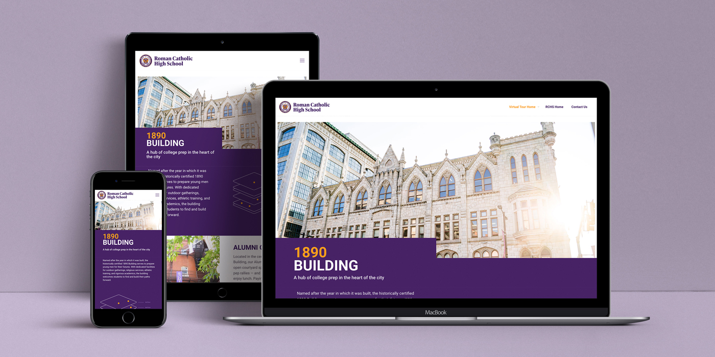
What appears as a masterpiece on your desktop might be a train wreck on your phone. Take the time to create responsive sizes for the devices your customers use, including for mobile, tablet, and widescreen.

With Roman Catholic High School’s virtual campus tour, FVM worked to create a web experience that was intuitive for parents and students on any device.
5. Skipping the testing phase.
Make sure your website or app has been vetted by real people before it begins making a real impact on your business. Even a simple prototyping phase can help you avoid being blindsided by a major error later on.
6. Straining your visitors’ eyes.
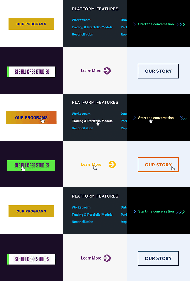
Keep things clear and legible: Pay attention to font sizes and column widths for text. Use sufficient color contrast — this is also necessary for ADA compliance. And choose obvious hover effects to make it clear what is and is not a link.

Examples of various interactive buttons FVM created. Each is clear in purpose as well as direct in contrast and legibility.
7. Crowding your top-level navigation with links.
When all your important information gets top billing, none of it stands out. Instead of overwhelming the top of the screen with too many links, consider using top-level pages to guide different audiences toward their specific solutions.

For West Chester University Foundation’s website, we balanced strong audience messaging direction with clear site architecture and information hierarchy.
8. Leaving visitors stranded if they make a mistake.
Your customers are busy: Typos and stray clicks are inevitable. Whenever you ask for input, such as on a form field requiring a valid email address, make any input errors clear — allowing users to correct mistakes and confirm changes.
9. Overwhelming users with walls of text.
Too much content is daunting. Establish a clear type hierarchy using page titles, sections, and sub-heads to break up text and guide users along. Limit column widths — 50 to 75 characters is a good baseline. Click-to-expand accordions can also help keep your sites concise and tidy.
Intentional or not, UX and UI decisions like these are already shaping your brand every time someone interacts with your website or app.
The right approaches ensure easier decision-making, getting prospects further down the funnel and improving your ROI. The wrong approaches can frustrate users — or turn them off entirely.
That’s why UX and UI are especially important for B2B businesses. Over time, these seemingly small elements can make a major impact on considered purchases.
By avoiding common mistakes like the ones above, you can build trust, drive conversions, and continuing hitting your business goals.
Need help understanding your users and improving your website? Contact FVM today.
