Sharpening a B2B telecom company's competitive edge
Background
Lightpath is no small player in the New York telecom space. For decades, they’ve worked to connect thousands of businesses in the New York metro region to their unparalleled fiber optic network. The problem? Lightpath had never found a focused, consistent way to sell the value of their products and the work that went into creating them. Was the company’s commitment to personal connections what drew customers in, or was it just one of many reasons they chose to stay?

Strategy
As FVM dove into the discovery process with Lightpath, themes emerged and recurred. Personal connections were certainly a big one, with employees trumpeting their outstanding knowledge and customer service as something that set them apart from impersonal national brands. But the raw muscle behind Lightpath was also a major factor. The company’s outstanding fiber optic network was built, maintained, and run completely by the people of Lightpath. Where competing telecoms borrowed pipe or piggybacked on the sweat of others, Lightpath had end-to-end control over every inch of their lines.
Perhaps unsurprisingly, we also found Lightpath held exceptional pride in its New York identity. After all, it had done so much to cultivate both its fiber optic network and its interpersonal network across the City. A closeness to the infrastructure and people of New York were critically important to building this brand.
Altogether, the new Lightpath would unabashedly be about work. Putting in the work to build an enterprise grade network businesses could actually count on. Or, when things went wrong, getting to work immediately to make things right. Work also meant spending the time on the phone and in person with customers to understand what their companies needed, and doing what it takes to deliver it.
The brand wouldn’t be afraid of talking about work either, because the new Lightpath would be proud of what it had achieved. From a messaging standpoint, that meant direct copy that leveled with the reader. Gone would be the platitudes about “what modern companies need” or how “businesses are looking for blah blah blah.” From here on out, the Lightpath brand would only be engaging customers with a proud, personal tone.
Our solution
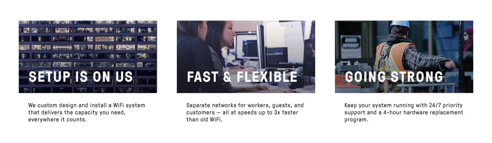
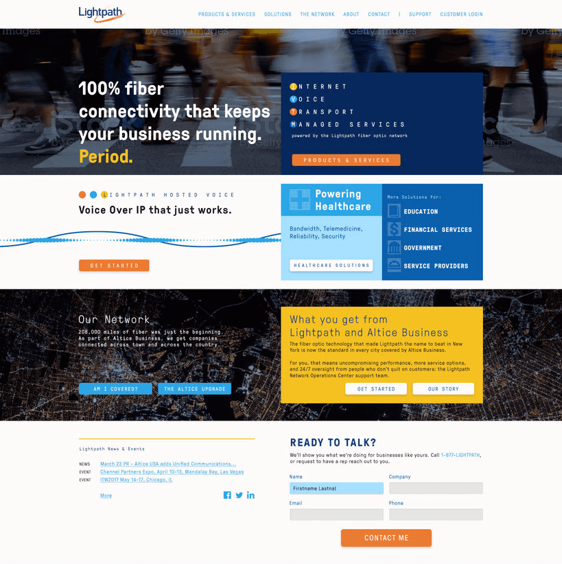
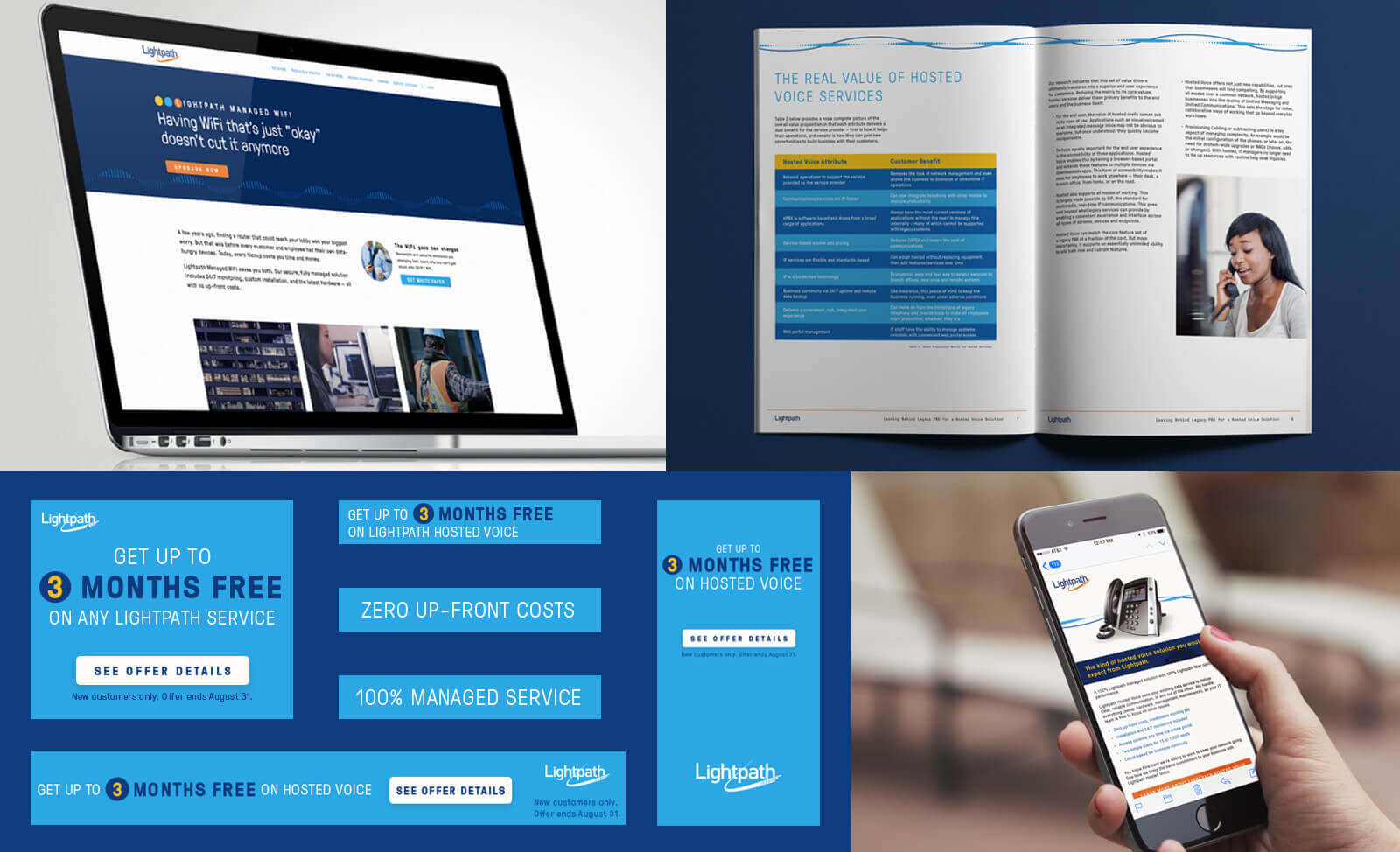
On the visual front, we left behind overused telecom photography like upward-glancing shots of glass skyscrapers, flying neon pixels, and overly happy (read: unrelatable) customers. Instead, photos would focus on the practical use of technology, birds-eye views of the network grid, and street-level shots of New York. The latter was especially important; this point of view reinforced Lightpath’s ground game as an established NYC telecom.
Blue and orange tones from Lightpath’s history were strengthened and expanded upon. New light blue and yellow options joined the brand’s palette. We then introduced subtle motifs that played off Lightpath’s identity. For instance, a triple circle accent used primarily in headlines evokes the look of both New York Metro signage and traffic intersections.
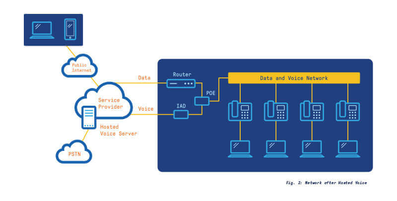
We also created patterns that hinted at the telecom technology behind the Lightpath network; dot matrix icons for fiber optic cross sections, and sine wave patterns that identified each of Lightpath’s internet, voice, and data transport products.
Results
With the Lightpath story and identity refocused, the brand could be extended into all company communications. From landing pages and white papers to banner advertisements and email campaigns, we were proud to share Lightpath’s compelling value with prospects looking for a provider that was willing to work for their business.
Ready to get started?
Contact us to discuss how FVM can support your B2B marketing goals.