Getting the story straight: communicating a client’s compelling value
It’s not every day that someone can honestly say their work will advance the field of oncology. Yet in the first few minutes of our project briefing with the clients, it was clear they had built something truly revolutionary.
Proscia had created a digital pathology platform with unprecedented capabilities for professional collaboration. And it was being brought together by a team of brilliant young minds with multidisciplinary expertise.
This underlying story was strong and inspiring.
Unfortunately, it was almost completely absent from the existing Proscia website.
Elements of the Proscia story were scattered and hidden beneath technical details and obscured by layers of navigation. As a result, visitors could not quickly understand the value Proscia offered, and were therefore likely to leave the site with a bias against an otherwise impressive concept.
The hard part — questioning everything
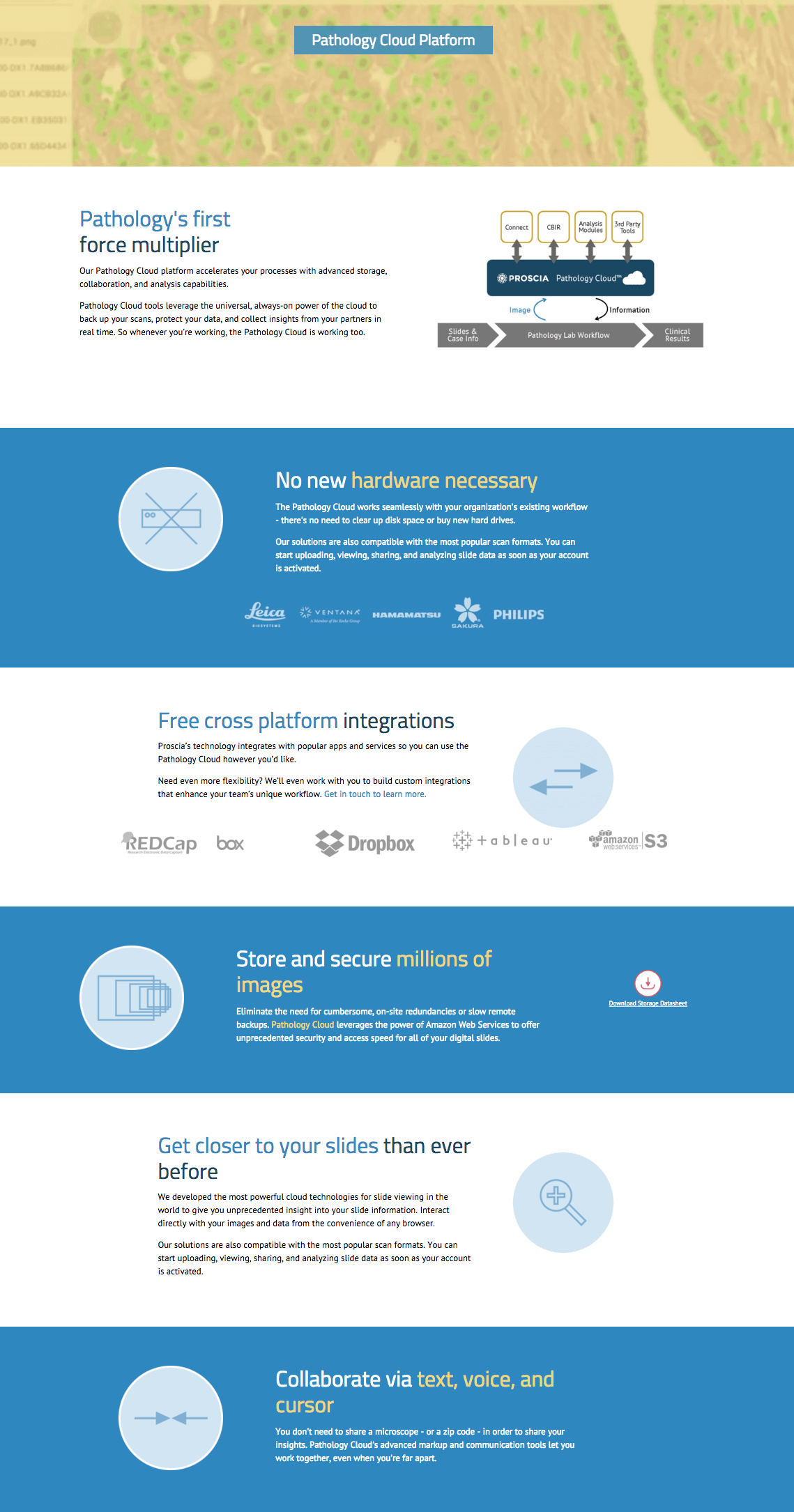
For a biomedical startup like Proscia, a website has to convey very specific information in an efficient and digestible manner.
Our work began as it always does, by posing critical strategic questions to our clients and to ourselves about the nature and purpose of the project.
- What is the value of the product or service?
- Who are our intended audiences?
- What do we want those people to do?
What is the value of the product or service?
The value, as outlined above, was relatively clear to us, but needed to be brought to the surface for new site visitors.
People who entered Proscia.com without a brief on the technology might be hard-pressed to say what Proscia as an organization did, or what kind of products and services they offered.
There was language about Proscia as a company, but also as a service. There was a platform with several sub-modules, but it wasn’t obvious how they worked together, or in what configurations they could be purchased. We needed to untangle these issues and present an understandable hierarchy of information to every visitor.
Who are our intended audiences?
Speaking of visitors, Proscia had several important audiences. On the scientific side, they had to reach clinicians, researchers, and educators simultaneously. But as a startup, Proscia was also looking to generate interest among potential investors.
The scientific group was already served with deep technical material diffused across a few pages (including specialized segmented content). But investors and journalists who weren’t already fluent in this kind of technology would most likely be lost.
Details on Proscia’s business model were also hard to find. It wasn’t obvious how much the company intended to charge for its services, or what the general sales process was. We were also concerned this could hinder interest among potential customers who couldn’t gauge if Proscia’s products fit into their budget , or how the products would integrate into their existing workflows.
What do we want those people to do?
Relating directly to our concerns about hidden costs, we wanted to know what the ideal action path of a Proscia.com visitor would be.
Immediate spot-conversion subscriptions wouldn’t make sense; this was an advanced suite of pathology services that could potentially be used by hundreds of people within a purchasing organization. Our clients knew the focus should be on familiarizing people with the software and opening channels for in-person dialog.
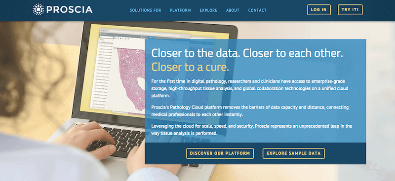
Proscia.com did have CTAs relating to free demos and contact points, some were redundant (multiple buttons that seemingly did the same thing), and others were relegated to the bottom of unrelated pages. The thinking was right, but it needed polish to drive conversions.
With essentially five CTAs grouped together, there is no clear action path to drive visitors towards conversions
The easy part — Reimagining the entire website
It might seem odd to consider completely making over a site’s architecture the easy part of the creative process.
But as an agency, we pride ourselves in digging deep into our clients’ business. We do the heavy lifting up front — all the due diligence and homework necessary to wrap our heads around not just the project at hand, but every factor affecting the client’s brand.
So at this point in the process, we had very clear understandings of what Proscia.com needed to accomplish, the value it proposed, and the audiences it would serve. What few questions remained about their business model and product hierarchy were cleared up after a few extremely productive client meetings.
We were ready to answer the questions we had previously asked, in the form of a new Proscia website.
What is the value of the product or service?
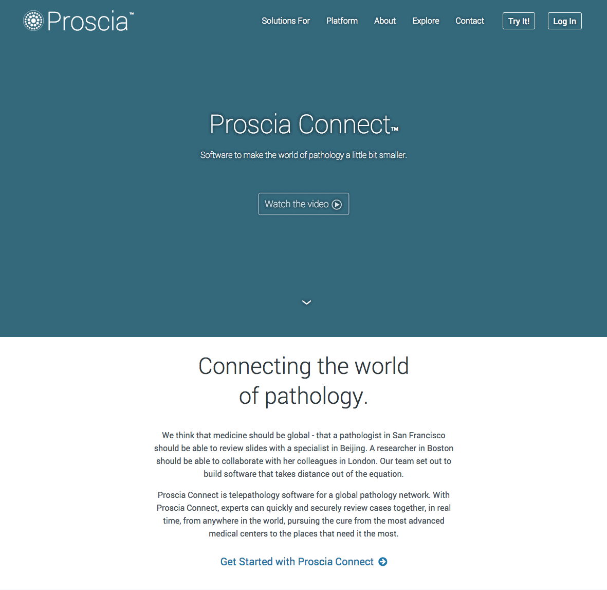
With the new Proscia.com, the very first thing visitors see is a clear explanation of exactly what the company offers and how it benefits medical professionals.
We don’t expect anyone to be instantly swayed by this introduction, even as compelling as it is. So we give them three avenues to follow.
1. DISCOVER OUR PLATFORM
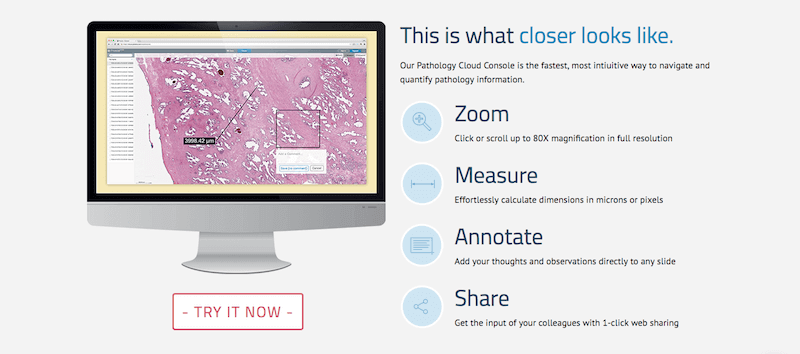
This CTA takes visitors to the more technical /platform page, which sells the features of Proscia’s software and outlines exactly what buyers at different levels of organization will get with their subscriptions. From there, they can request a quote.
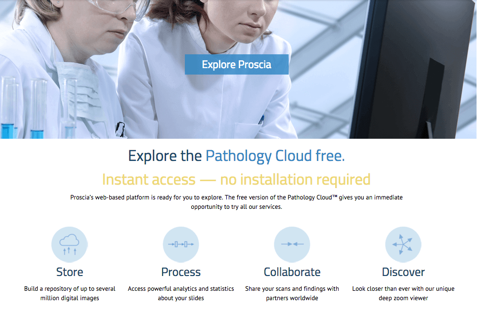
2. EXPLORE SAMPLE DATA
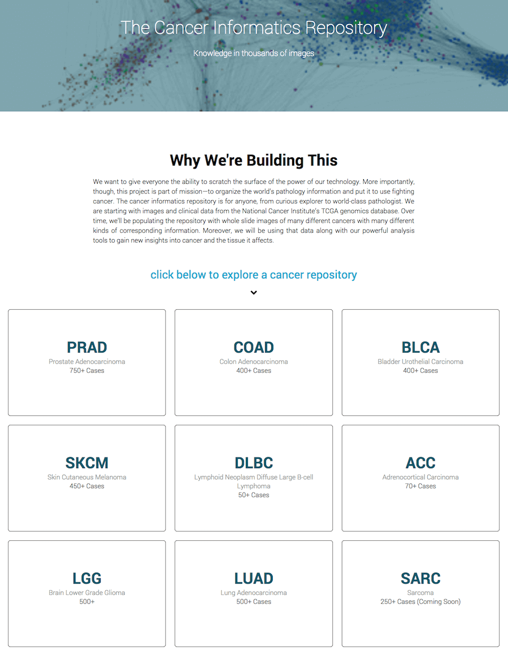
Visitors who are ready can dive into Proscia’s free online trial, seeded with sample data from the National Cancer Institute. There’s no time limit on the demo —users can take as long as they want to fall in love with the software.
3. NAVIGATE THE SITE
Anyone who isn’t moved to immediately consider features or a demo can still absorb a great deal through organic exploration. Further down the page, users learn about the team behind Proscia and their long-term vision for their technology. Journalists also gain fast access to company history and contact information.
Who are our intended audiences?
In both the top-level navigation and directly under the introductory homepage content, we’ve included paths for Proscia’s three primary scientific audiences: researchers, clinicians, and educators.
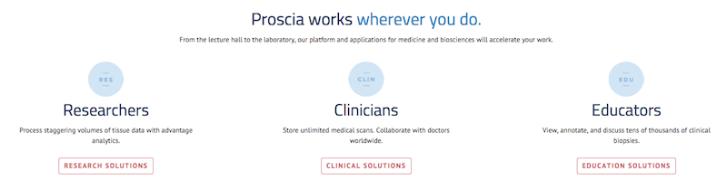 Each group gets its own page explaining exactly how the Proscia platform can supplement and enhance daily work. Both tangible examples and futuristic visions are included to convince and inspire readers.
These brief pages then drill down to CTAs that invite users to explore sample data, create their own repositories, or learn more about a Proscia partnership.
We didn’t forget about Proscia’s secondary audiences in investment and the media. But instead of giving these groups their own content, which would feel out of place, we focused on keeping the language accessible throughout the site so these visitors wouldn’t get lost. Language is also peppered with memorable talking points that can be easily underscored by Proscia representatives in sales pitches or one-on-one interviews.
What do we want those people to do?
More so than any other objective, Proscia needs visitors to believe in the power of its technology. Once that belief is established, it is not unreasonable to initiate conversation with individual prospects about how Proscia can solve their pathology needs.
So every element of the site — the visuals, the story, and the software itself — need to convey unprecedented technological functionality while overcoming potential concerns about workflow disruption or the company’s credentials as a startup.
By now you understand some of the narrative we solidified for our clients (for the full story, see the Proscia website.) A great deal of the remaining work was getting people to interact with that narrative and explore Proscia.com.
FVM’s designers really pulled through here. You can of course compare the site’s previous and final aesthetics, but even that would not do their work justice.
About page
Demo CTA
Here is just some of what they accomplished:
- Cleaner, more digital-friendly Proscia logo
- Simpler, more consistent color application
- Compelling type with high readability
- Strategic photography to draw users in
- Icons that intuitively define features
- Highly visible yet unobtrusive CTAs
Working cohesively with the new website narrative, its design cements Proscia as an inviting, capable, and modern company poised to advance cancer research.
The moral of the story
With Proscia, we were honored to have the opportunity tell a moving story about people and technology that truly impressed us. Our clients were individuals who had an expertise in biometrics, data analysis, and network dynamics. For branding and marketing, they turned to FVM. Our experience telling stories and building websites was of course a major factor in their agency selection.
Every business and website is different, but on a fundamental level, our process is not. It lives and dies by our ability to understand at a strategic level how our clients operate and what role their websites play in achieving specific objectives.
The transformation of Proscia.com is an excellent example of what we can achieve when we get the opportunity to immerse ourselves in our clients’ business. And we like to believe our hard work (and yes, our easy work) will pay off for Proscia, for medical professionals, and for the patients they treat every day.